The Problem
Game admin dashboards like Steam and Epic Games are unflexible and limited in use.
Goals:
Create customizable game dashboard
Expand audience to appeal to different age groups and use cases
The Interface
Users can drag-and-drop any of our widgets onto their administrative dashboard to focus their experience on connecting with friends, managing streaming income, tracking game progress, and much more.

Users can customize the dashboard with stickers from their in-game achievements.
Users can change between color schemes, including dark mode.
Widgets
Widgets are highly customizable, scalable, and able to be swapped in and out depending on the user needs and experience.


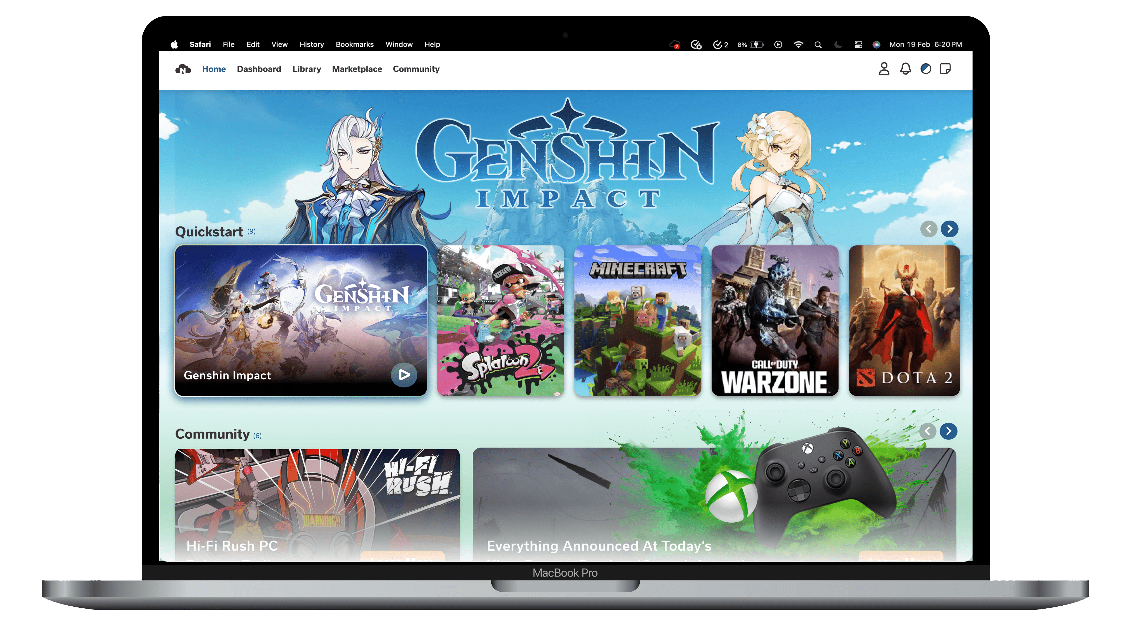
Homepage
Nimbus uses a quick-start navigational section to allow users to quickly jump into their most recent game without any distractions.
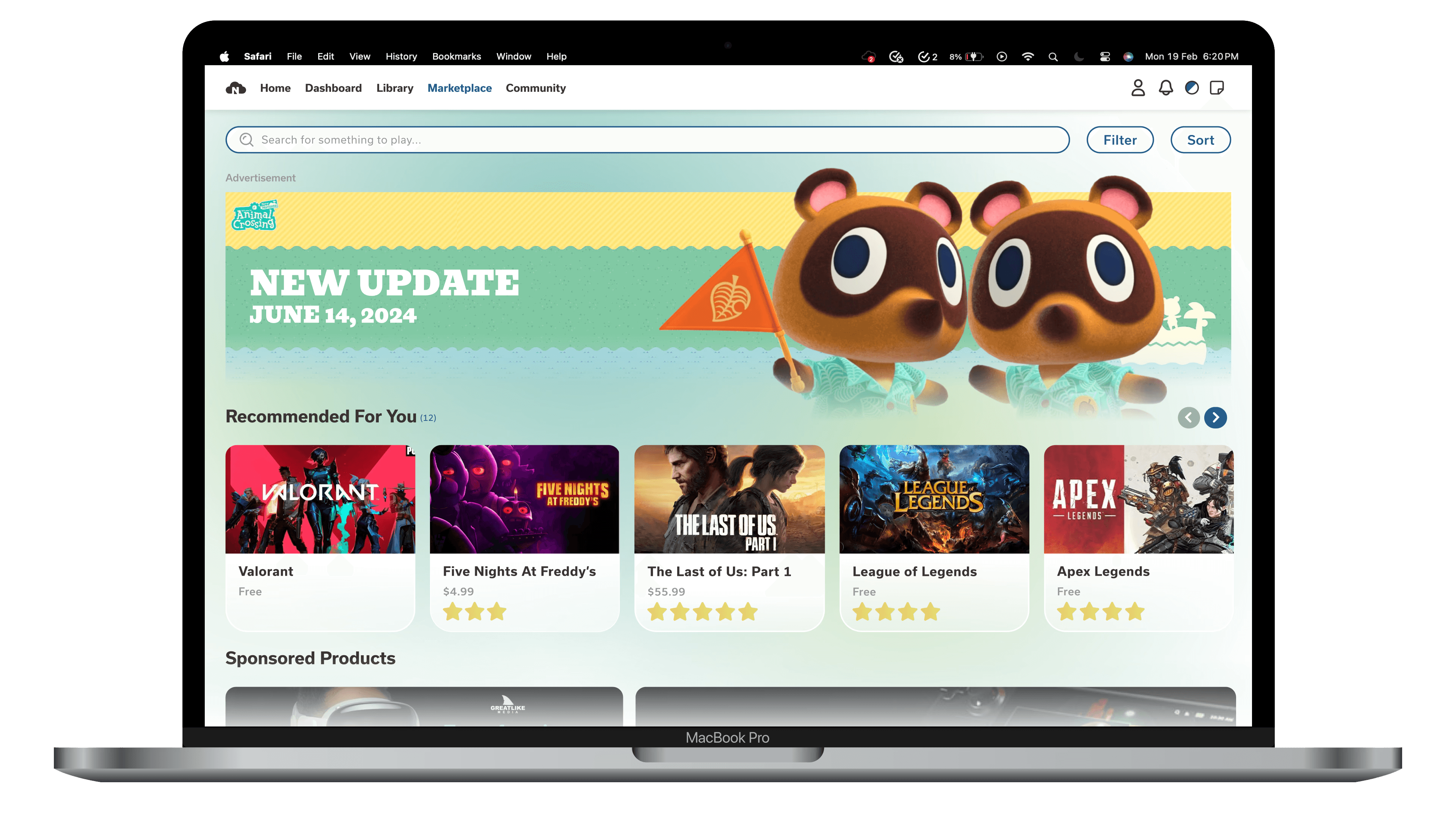
Marketplace
The marketplace gives users relevant, data-driven information about trending games that they might be interested in based on their current library.
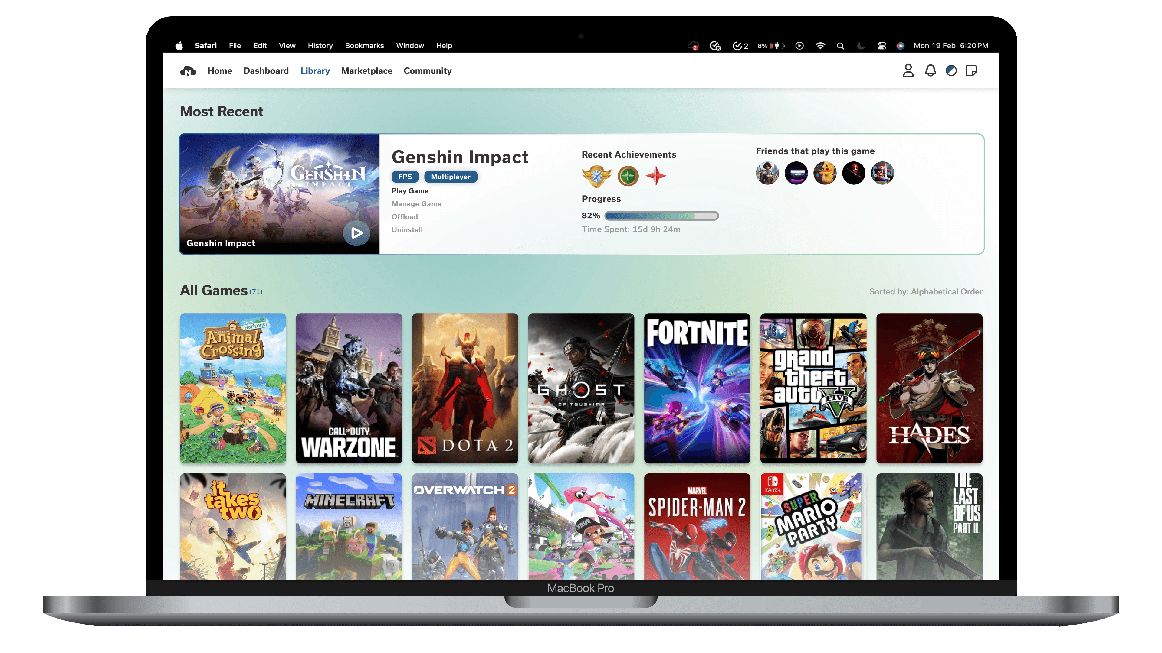
The library page allows users to see their owned games alongside settings, recent achievements, and information about friends.
The Assets
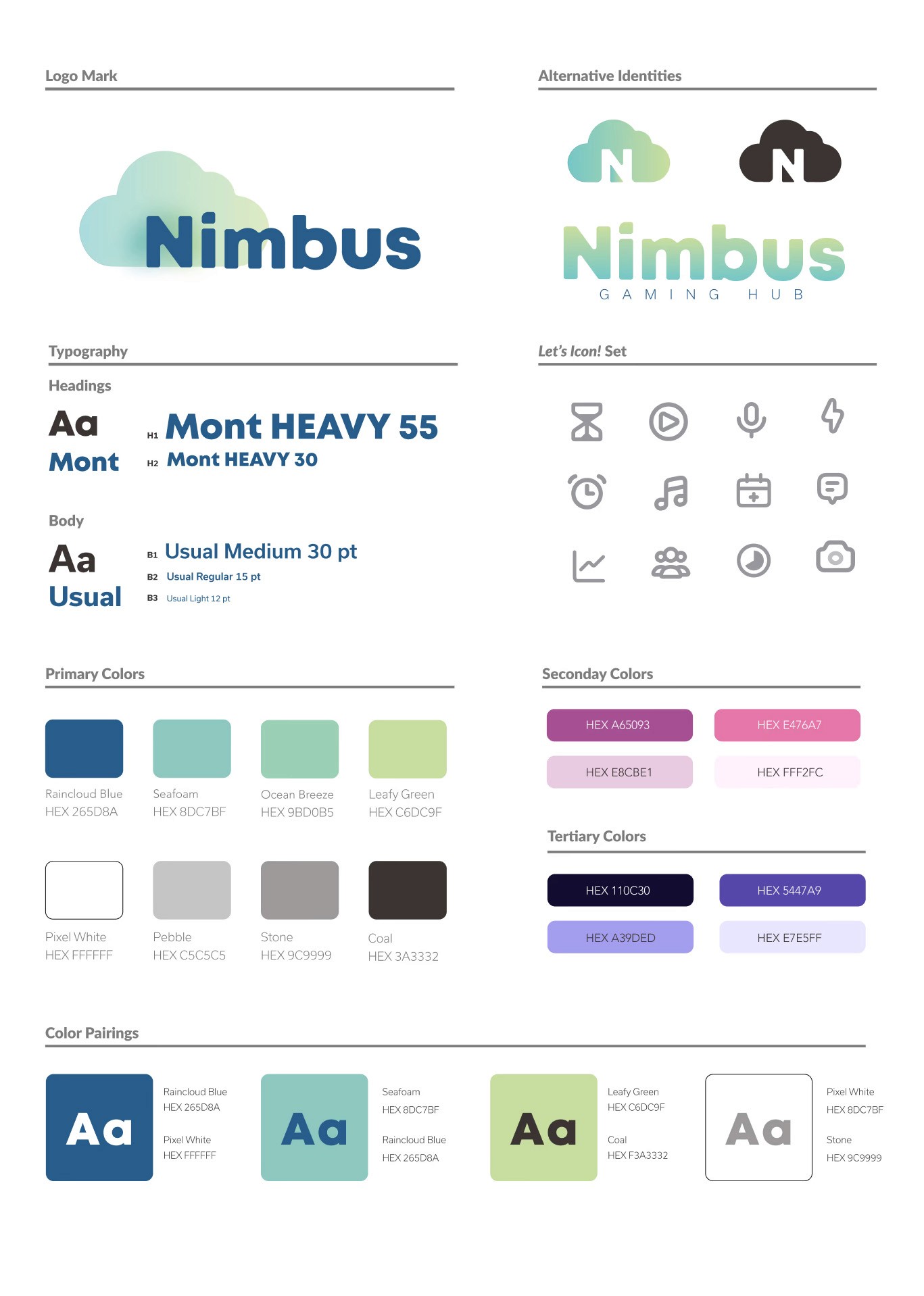
Nimbus uses a cloud-like, versatile logo and a blue-and-green color scheme, with supplementary color schemes for alternate colorways.


User Testing & Research
We checked for WCAG 2.0 web color accessibility requirements throughout our design process to ensure that users would be able to see our primary colors, even with limited visibility or color limitations.

Research and Competitor Analysis
We began our design process with an extensive research phase where we discussed gaming gender aesthetics, game launcher preferences, and interface pain points with a variety of respondents, both gamers and non-gamers. From this research, we learned that the top five streaming apps suffer from similar pain points: poor visual hierarchy, not meeting user needs, and limited functionality.


Personas
We used three personas to reflect three of the primary users of our web application, with information from our survey. The three dashboard interfaces we created reflect these three user personas and their pain points.


User Journey
Our user journey map reflects findings from the survey results, user personas, and competitor analysis. This map was critical to identifying the pain points that needed to be solved, as well as the solutions that could be applied.

Project Reflection
Creating web applications that are practical, visually compelling, and thoughtfully designed around user experience is essential to maintaining and growing a loyal audience. When functionality and aesthetics work together seamlessly, users are more likely to trust the product, return consistently, and engage more deeply over time.